#22: Check your icons →
From Emma:
This tip is something I learned from a coworker at the Capital Area District Library when they replaced the sign on our accessible public computer station (yes, the fact that we had a single, designated one is sub-optional for sure). The traditional ‘disabled’ or ‘accessible’ icon in the United States looks like this:

Pictogram of person seated upright in wheelchair, no arms visble
The one advocated by the Accessible Icon Project looks like this:
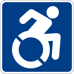
Pictogram of person in wheelchair leaning forward, arms behind to push chair
In the second image, the person using the wheelchair is pushing themselves, rather than passively waiting to be pushed. It’s not a huge design difference, but it’s a clear one, and taking the time to learn that the new icon exists and update your signage is a clear way to signal that you care about this stuff.
I took a look around my library for instances of this image and noticed that we very rarely use pictograms of any kind anywhere. Normally I’m pro-pictogram, but in this case it was good news since there weren’t a bunch of old-style icons that needed to be replaced. In fact, the only places where we have this pictogram are the handicapped parking spots—both on the signs and painted on the ground in the spots. The signs are in good shape and as much as I’d like to get new ones with the new icon, I suspect they would be hard to get (both because they don’t seem to be widely available on the market and because I know our city has some pretty restrictive contracts for signage) and I’d rather use the money for higher-priority accessibility changes in my building, such as:
Fully-bilingual English/Spanish signage in the interior of the library
Replacing the frequently-out-of-order automatic front doors
Barrier-free access to our public restrooms
However, both the handicapped icons and the stripes themselves on the surface of the parking lot are pretty faded. I suspect we will soon be due for repainting, and when that comes up, I will definitely ask if the icons can be repainted in the new style.
Although I wasn’t really able to act on this tip, I’m still glad I tried it out because it made me examine my signage carefully (You would think I do this a lot considering my interests, but there is just so much of it in libraries! I am always discovering new stuff I forgot to review.) and because realizing that I wouldn’t prioritize replacing the handicapped parking signs made me think a little more formally and rigorously about what I would prioritize. I have an accessibility wish list for my branch in my head, or at least I think of myself as having one, but I didn’t previously have one on paper that I could use to guide my interactions with our Facilities team and with library administration. Now, I’m sitting down to write one that I will be able to whip out if/when money becomes available to make some of these things happen.